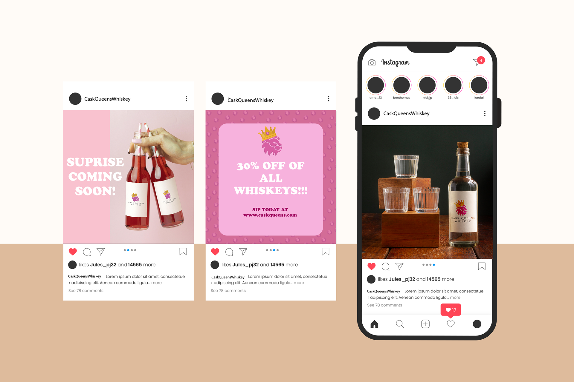
Project Overview
Cask Queens is a brand identity project created for a female-owned whiskey company. The project focuses on developing a bold and recognizable visual system that challenges traditional whiskey branding. It includes logo design, color palette, typography, and packaging applications. The goal was to create a cohesive identity that stands out on shelves while maintaining credibility within the whiskey market.
Cask Queens is a brand identity project created for a female-owned whiskey company. The project focuses on developing a bold and recognizable visual system that challenges traditional whiskey branding. It includes logo design, color palette, typography, and packaging applications. The goal was to create a cohesive identity that stands out on shelves while maintaining credibility within the whiskey market.
The Problem
The challenge was to design a whiskey brand in a category dominated by masculine visuals such as dark colors and aggressive styling. There is little representation for women in this space, so the identity needed to feel strong, confident, and feminine without appearing gimmicky or disconnected from the industry.
The challenge was to design a whiskey brand in a category dominated by masculine visuals such as dark colors and aggressive styling. There is little representation for women in this space, so the identity needed to feel strong, confident, and feminine without appearing gimmicky or disconnected from the industry.
Target Audience
Cask Queens is designed for women who enjoy whiskey and want to feel represented in the category. The brand appeals to those looking for something bold and empowering, while still maintaining the quality and seriousness expected from a whiskey brand.
Cask Queens is designed for women who enjoy whiskey and want to feel represented in the category. The brand appeals to those looking for something bold and empowering, while still maintaining the quality and seriousness expected from a whiskey brand.
Brand Needs
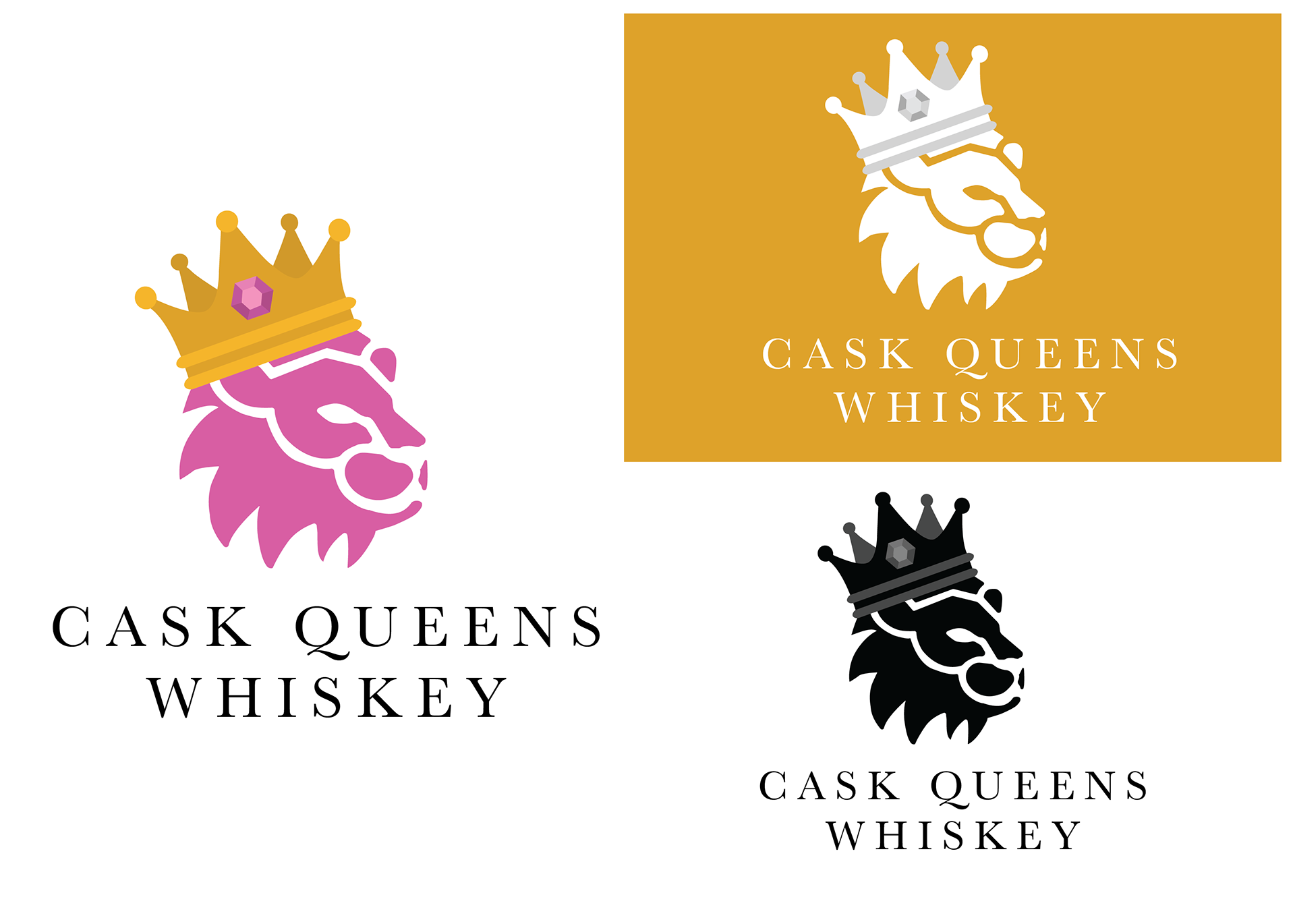
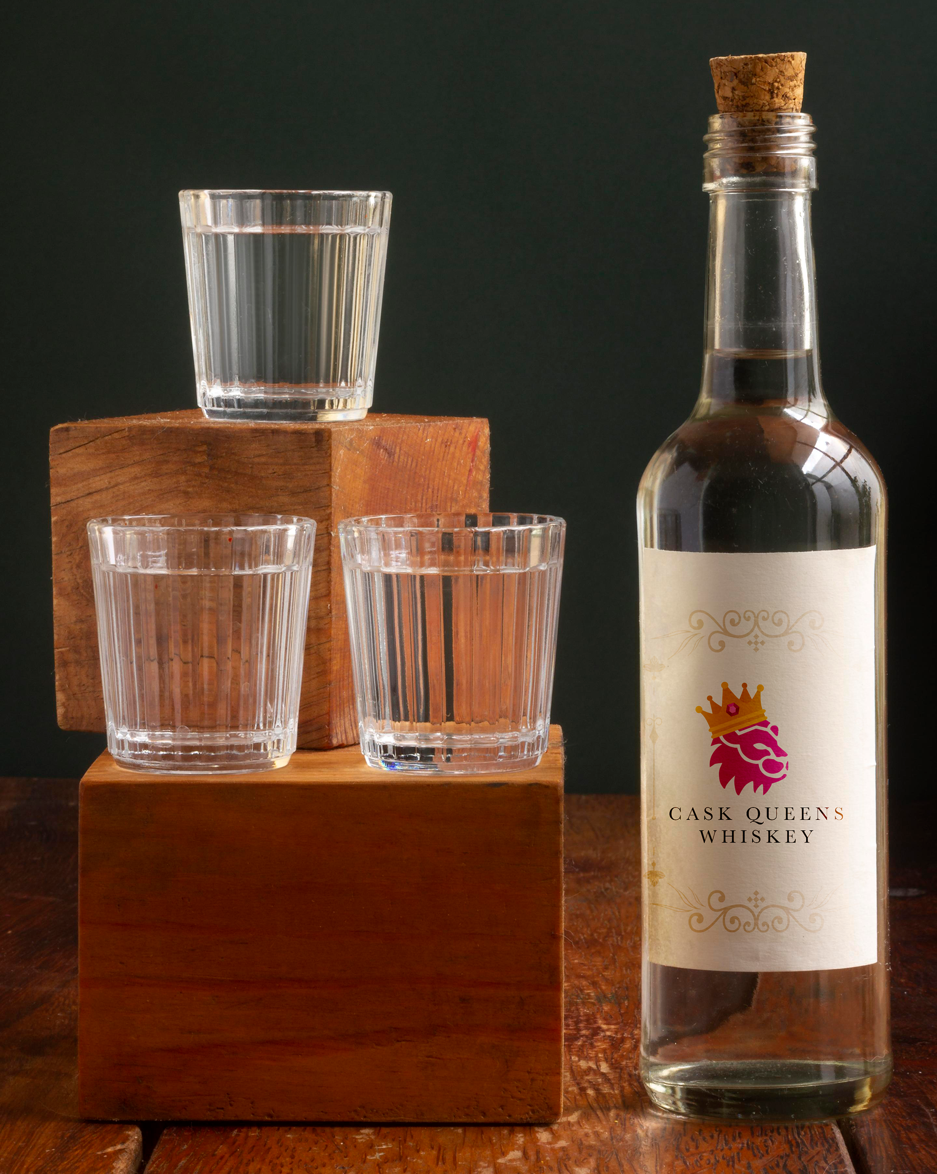
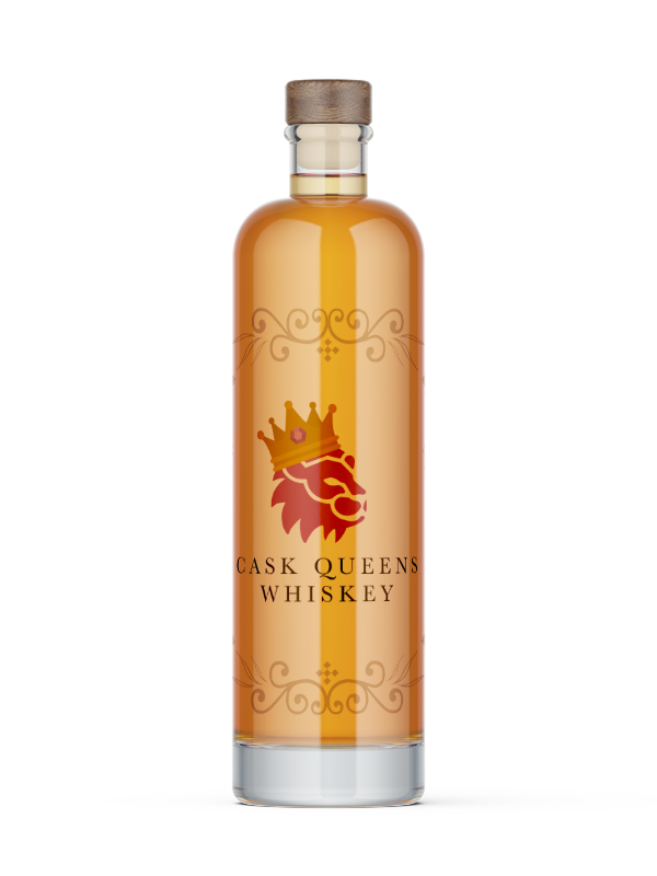
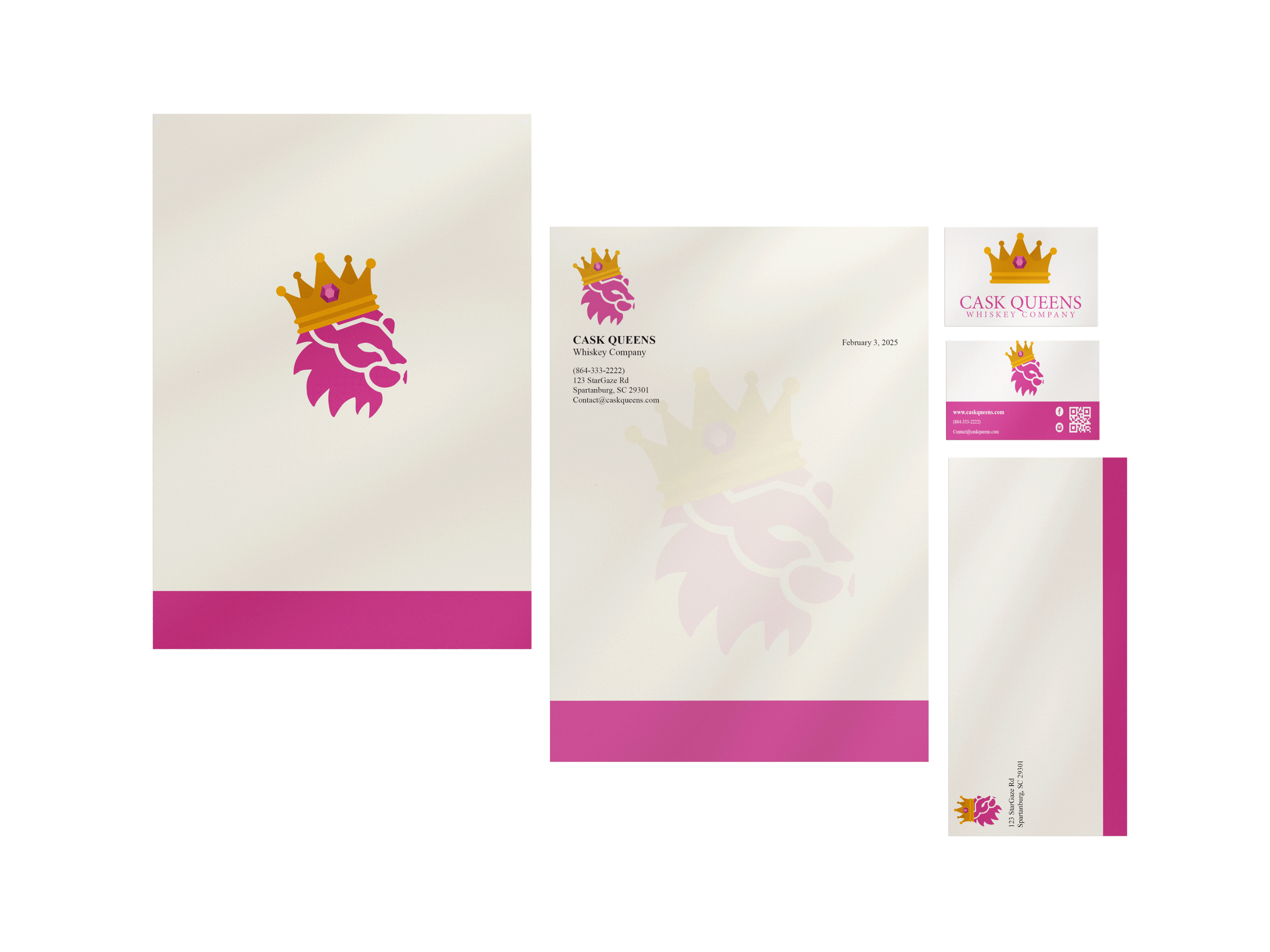
The brand required a strong and flexible visual system that could balance femininity with strength. This included a distinctive logo, a bold but intentional color palette, structured typography, and a clear layout system. Elements like the lion and crown were used to symbolize power and leadership, while the overall system ensures consistency across packaging and promotional materials.
The brand required a strong and flexible visual system that could balance femininity with strength. This included a distinctive logo, a bold but intentional color palette, structured typography, and a clear layout system. Elements like the lion and crown were used to symbolize power and leadership, while the overall system ensures consistency across packaging and promotional materials.