Project Overview
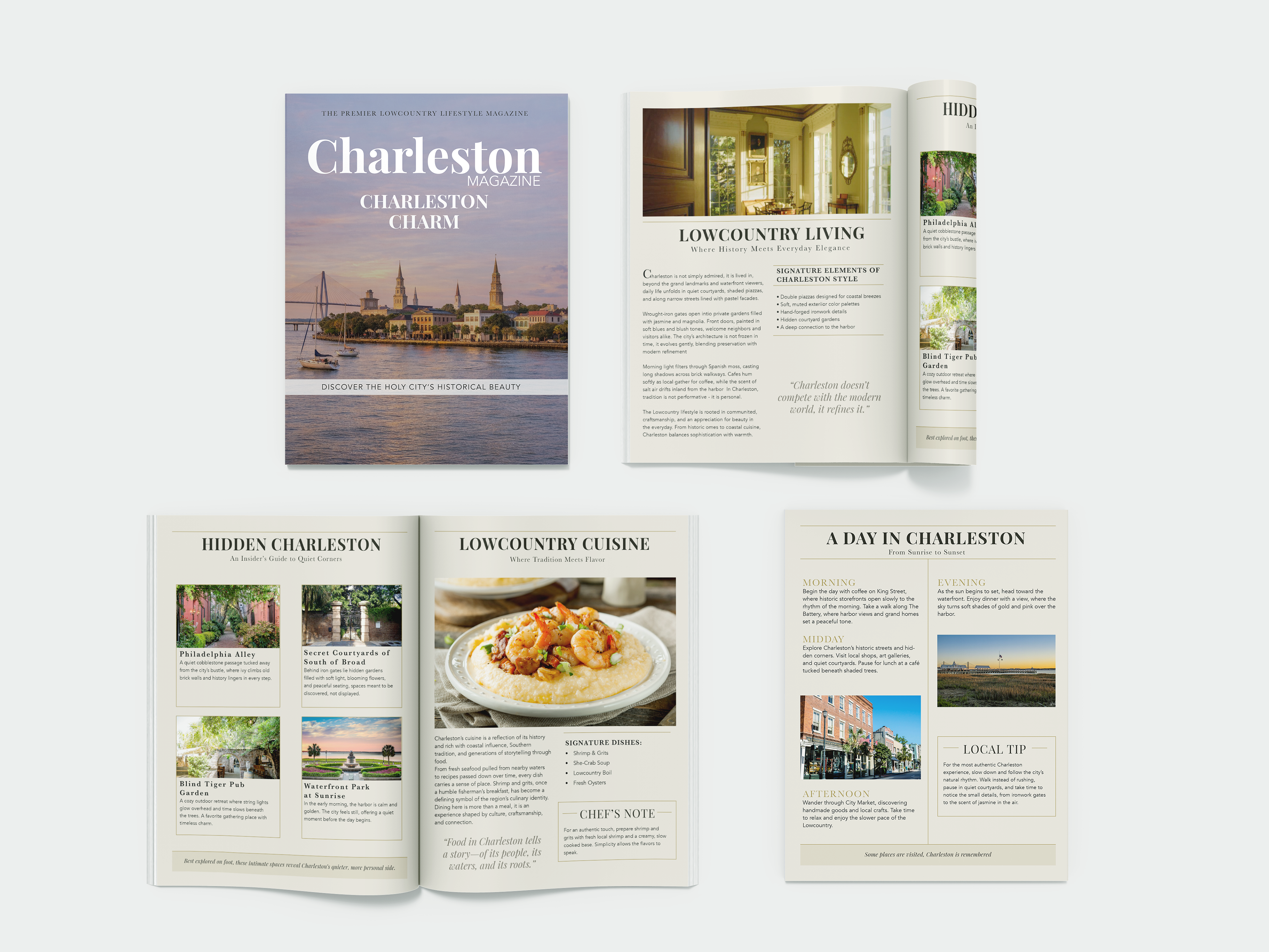
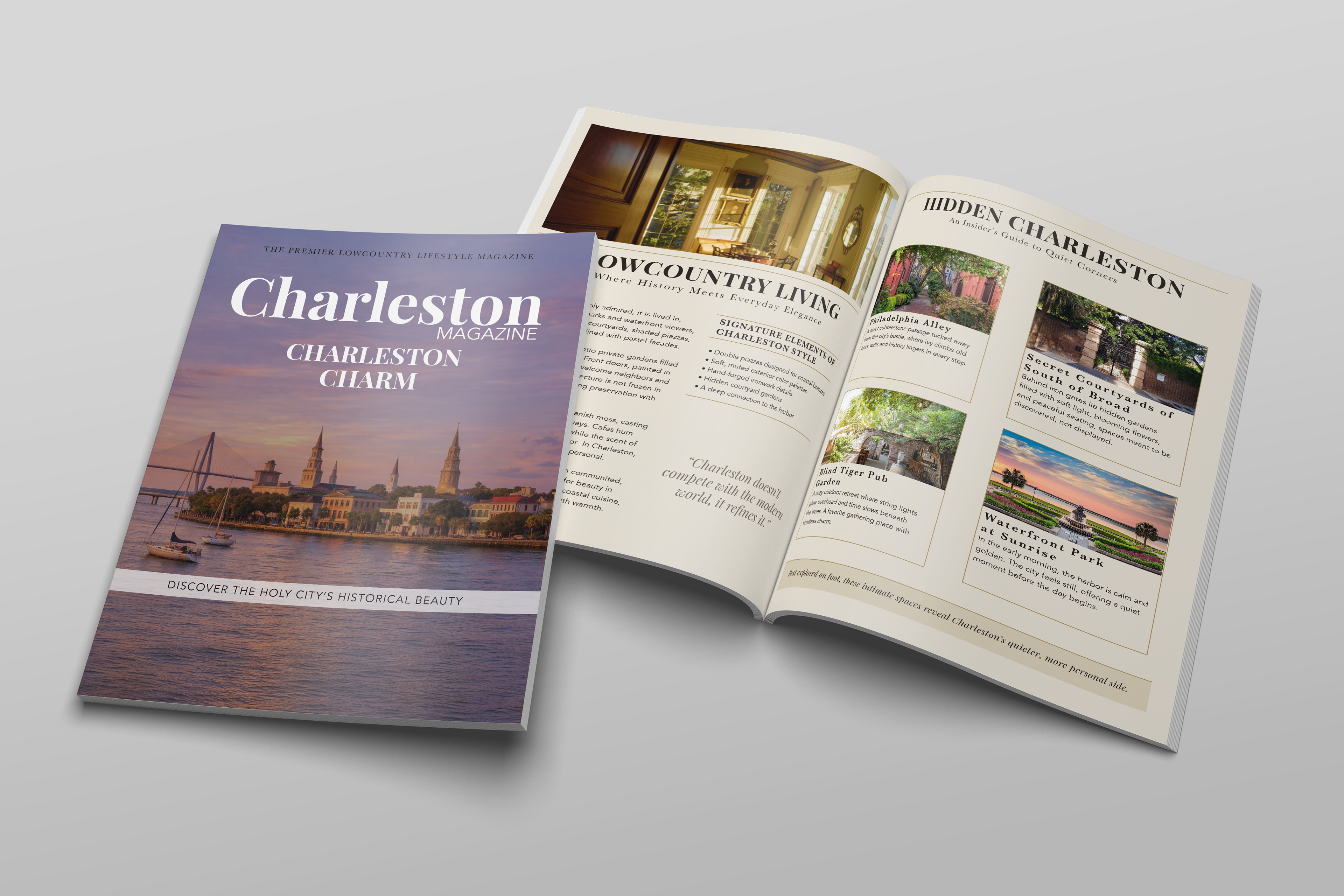
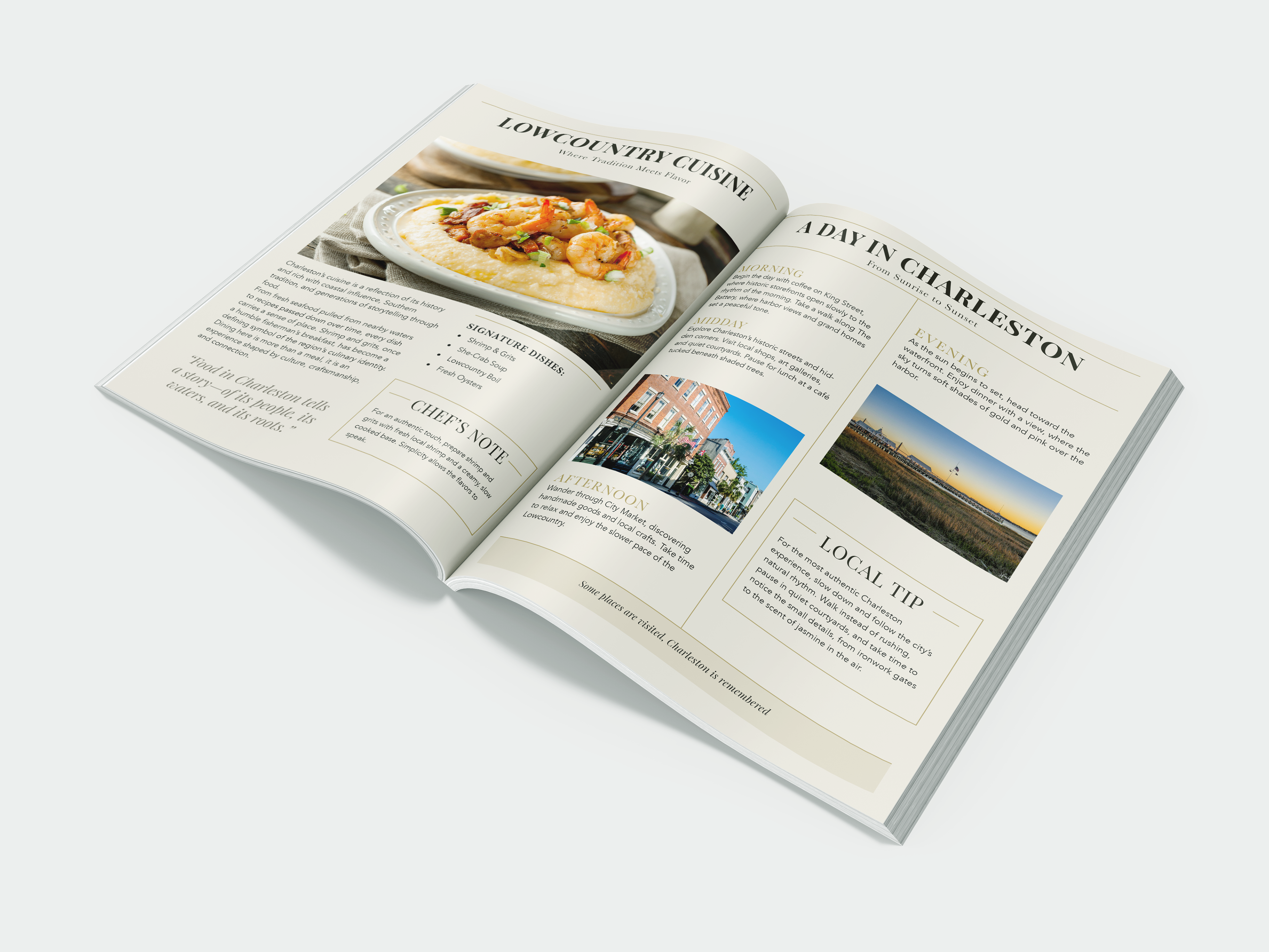
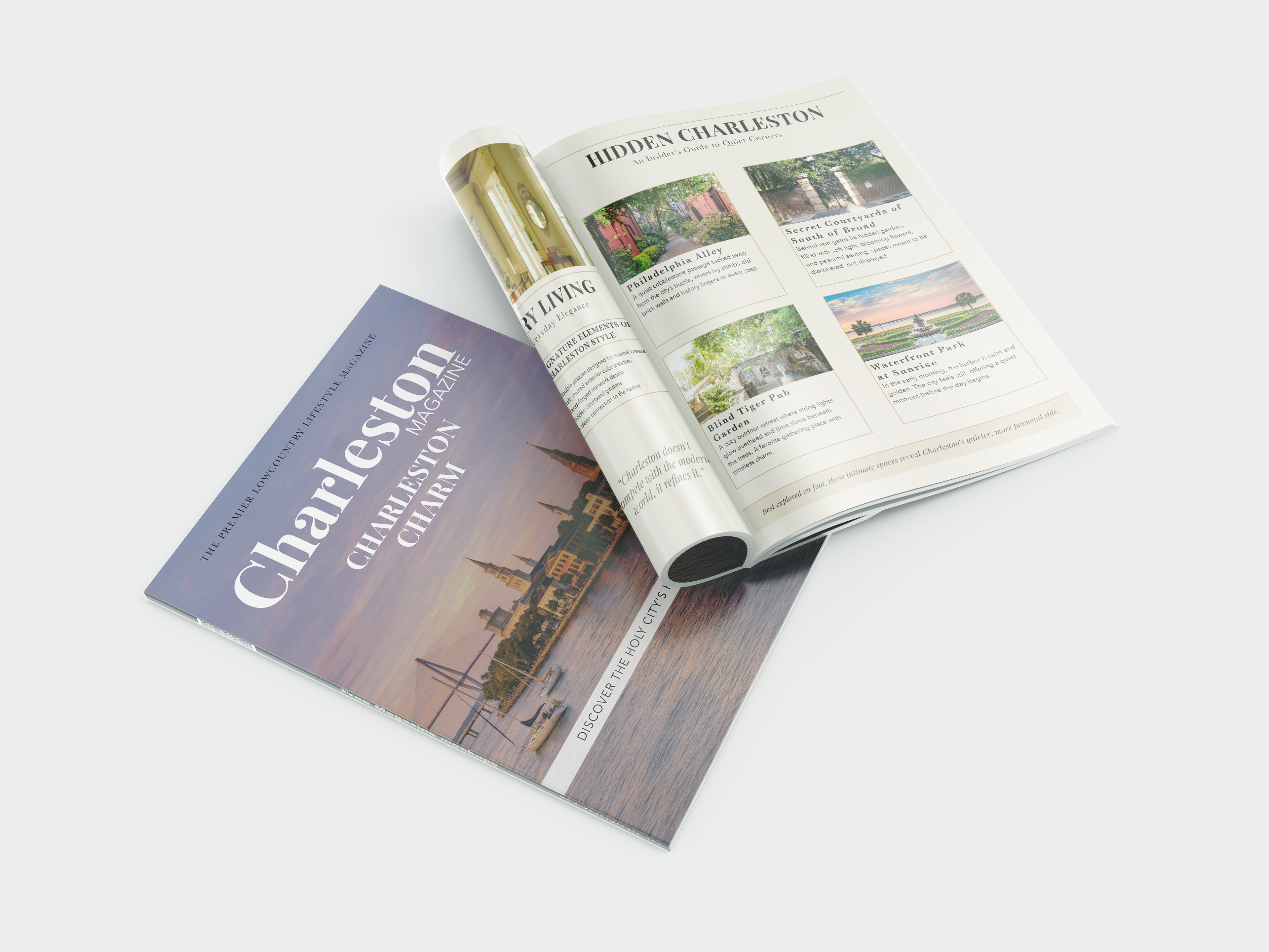
Charleston Magazine is an editorial design project focused on showcasing the culture, lifestyle, and visual charm of Charleston, South Carolina. The project includes a full magazine layout with a cover, feature spreads, and supporting articles. It highlights elements such as local architecture, cuisine, and daily life through a cohesive visual system. The goal was to create a refined and immersive reading experience that reflects the elegance and warmth of the city.
Charleston Magazine is an editorial design project focused on showcasing the culture, lifestyle, and visual charm of Charleston, South Carolina. The project includes a full magazine layout with a cover, feature spreads, and supporting articles. It highlights elements such as local architecture, cuisine, and daily life through a cohesive visual system. The goal was to create a refined and immersive reading experience that reflects the elegance and warmth of the city.
The Problem
The challenge was to design a magazine that feels sophisticated and timeless while still remaining visually engaging and easy to read. The layout needed to balance strong imagery with clear typography and structure, avoiding clutter while still capturing the richness of Charleston’s culture.
The challenge was to design a magazine that feels sophisticated and timeless while still remaining visually engaging and easy to read. The layout needed to balance strong imagery with clear typography and structure, avoiding clutter while still capturing the richness of Charleston’s culture.
Target Audience
The magazine is designed for readers interested in travel, lifestyle, and Southern culture. It appeals to individuals who appreciate thoughtful editorial design and are drawn to content that feels both informative and visually elevated.
The magazine is designed for readers interested in travel, lifestyle, and Southern culture. It appeals to individuals who appreciate thoughtful editorial design and are drawn to content that feels both informative and visually elevated.
Brand Needs
The project required a cohesive editorial system that could organize multiple types of content across spreads. This included a consistent typographic hierarchy, a soft and elegant color palette, and a structured grid layout. The use of large imagery, balanced white space, and refined type choices helps guide the reader while maintaining a calm and polished aesthetic across the entire magazine.
The project required a cohesive editorial system that could organize multiple types of content across spreads. This included a consistent typographic hierarchy, a soft and elegant color palette, and a structured grid layout. The use of large imagery, balanced white space, and refined type choices helps guide the reader while maintaining a calm and polished aesthetic across the entire magazine.