Project Overview
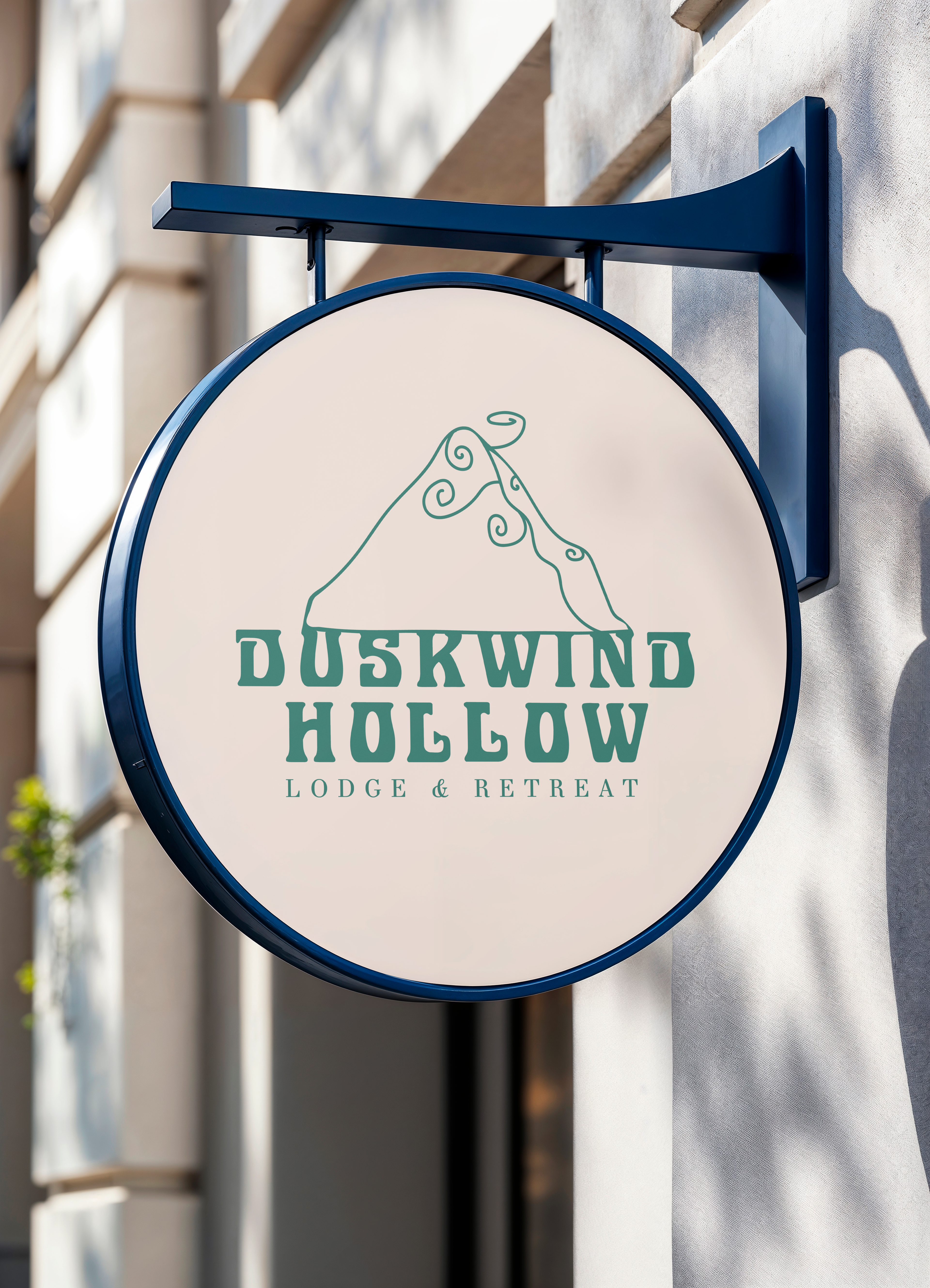
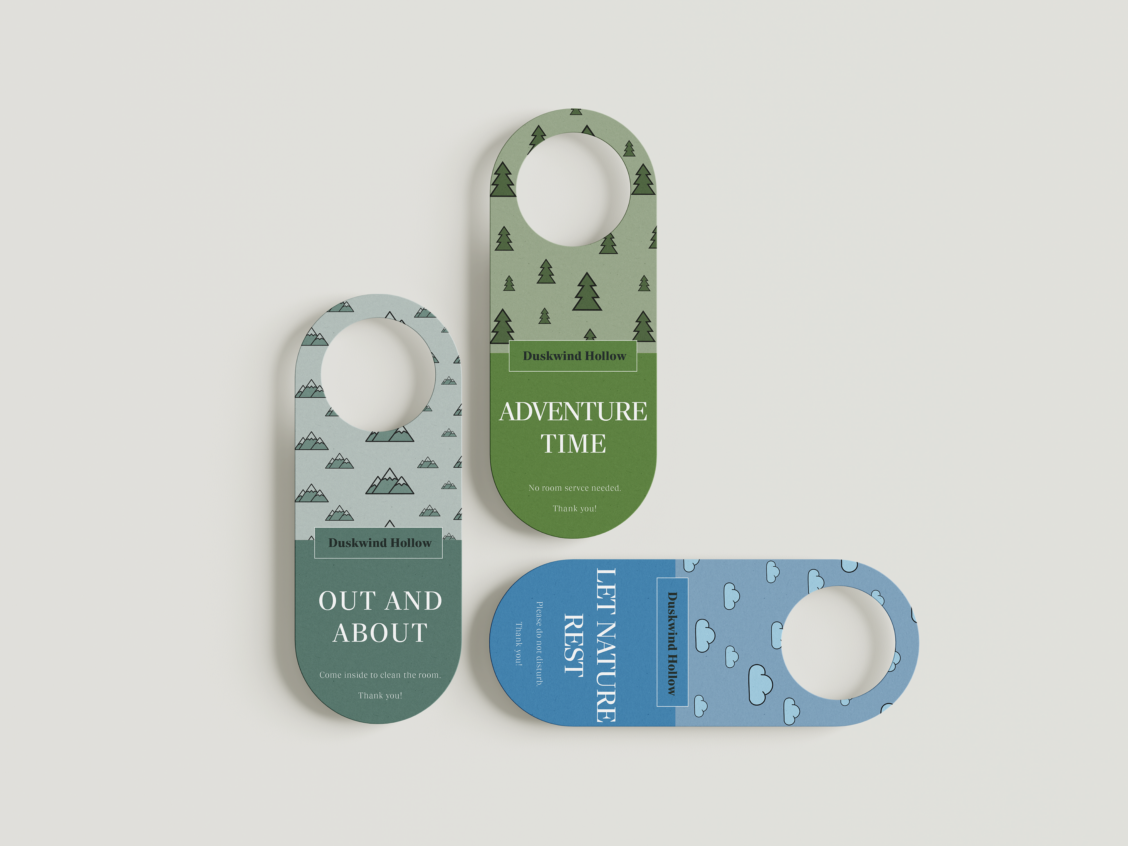
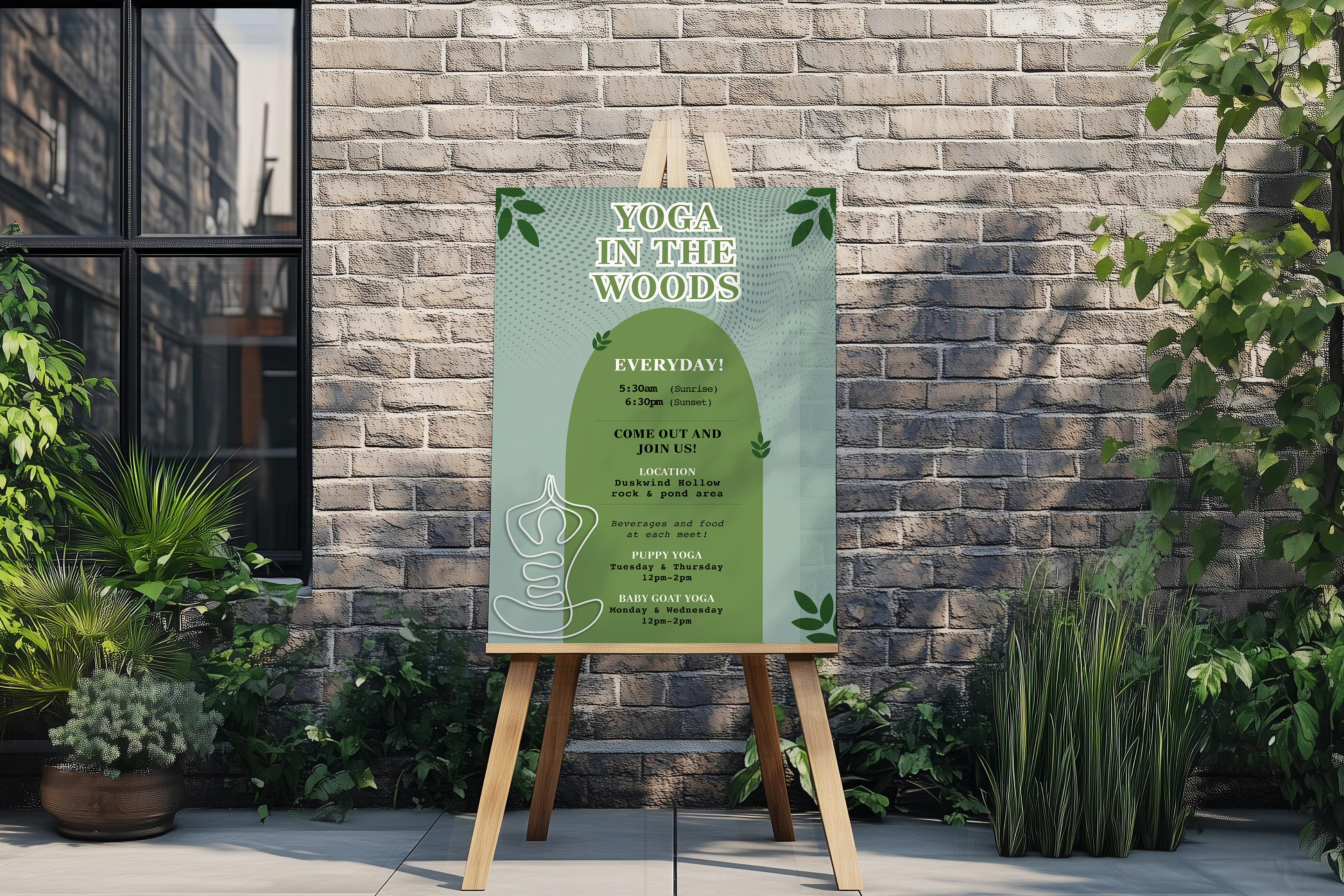
Duskwind Hollow is a brand identity project for a nature-focused lodge and retreat. The project includes logo design, environmental signage, and branded collateral such as door hangers and promotional materials. The goal was to create a cohesive visual system that reflects a calm, immersive outdoor experience while maintaining clarity and usability across guest touchpoints.
Duskwind Hollow is a brand identity project for a nature-focused lodge and retreat. The project includes logo design, environmental signage, and branded collateral such as door hangers and promotional materials. The goal was to create a cohesive visual system that reflects a calm, immersive outdoor experience while maintaining clarity and usability across guest touchpoints.
The Problem
The challenge was to design a lodge brand that feels peaceful and connected to nature while still being functional and easy to navigate. Many outdoor brands lean heavily into rustic or overly detailed visuals, so the identity needed to feel clean, modern, and approachable without losing its connection to the natural environment.
The challenge was to design a lodge brand that feels peaceful and connected to nature while still being functional and easy to navigate. Many outdoor brands lean heavily into rustic or overly detailed visuals, so the identity needed to feel clean, modern, and approachable without losing its connection to the natural environment.
Target Audience
Duskwind Hollow is designed for travelers seeking a quiet, nature-driven retreat experience. The brand appeals to guests who value relaxation, outdoor activities, and a sense of escape from busy, urban environments.
Duskwind Hollow is designed for travelers seeking a quiet, nature-driven retreat experience. The brand appeals to guests who value relaxation, outdoor activities, and a sense of escape from busy, urban environments.
Brand Needs
The brand required a flexible visual system that could work across a variety of applications, from signage to in-room materials. A nature-inspired color palette featuring greens and blues was used to reflect the environment, while simple iconography and patterns (such as trees, mountains, and clouds) reinforce the outdoor theme. Clean typography and structured layouts ensure readability, while the system remains consistent across elements like door hangers and signage.
The brand required a flexible visual system that could work across a variety of applications, from signage to in-room materials. A nature-inspired color palette featuring greens and blues was used to reflect the environment, while simple iconography and patterns (such as trees, mountains, and clouds) reinforce the outdoor theme. Clean typography and structured layouts ensure readability, while the system remains consistent across elements like door hangers and signage.